Overview
This report/blog post extends my previous work on classifying LIVE, DEAD, and BARE tree pixels in aerial imagery. It focuses on refining model performance through targeted labeling improvements, class rebalancing, and updated predictions across five years of NAIP imagery.
Objectives
- Improve class performance (especially DEAD) via more diverse and confident labeling
- Balance class counts to prevent overfitting to LIVE
- Apply the updated model to 2014–2022 rasters and evaluate class distribution trends
- Quantitatively validate whether observed changes in class proportions over time are statistically significant
- Explore visual and quantitative summaries of tree pixel transitions
Label Improvements and Class Balance
A significant portion of this work involved adding high-confidence LIVE samples in underrepresented years (especially 2018 and 2022) and increasing the BARE count.
Final Label Distribution
| Class | Count |
|---|---|
| LIVE | 153 |
| DEAD | 113 |
| BARE | 103 |
| Year | LIVE | DEAD | BARE |
|---|---|---|---|
| 2014 | 28 | 23 | 19 |
| 2016 | 39 | 18 | 16 |
| 2018 | 24 | 22 | 31 |
| 2020 | 38 | 24 | 11 |
| 2022 | 24 | 26 | 26 |
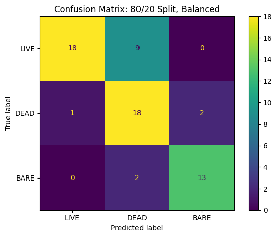
Model Evaluation (80/20 Split)
Using the updated labeled dataset of 369 labeled pixels across five years, I trained a Random Forest classifier using an 80/20 stratified split and class_weight="balanced" to account for class imbalance. The confusion matrix and metrics below reflect performance on the held-out 20% test set.
Confusion Matrix
Classification Report
              precision    recall  f1-score
LIVE            0.95       0.67     0.78
DEAD            0.62       0.86     0.72
BARE            0.87       0.87     0.87
Observations
- DEAD recall improved significantly due to class weighting and additional examples
- LIVE still dominates in precision, but shows some confusion with DEAD
- BARE remains stable and accurately learned
Raster Map Comparison (Pre vs Post)
To assess model improvements in the wild, I compared raster predictions for 2020 before and after balancing:
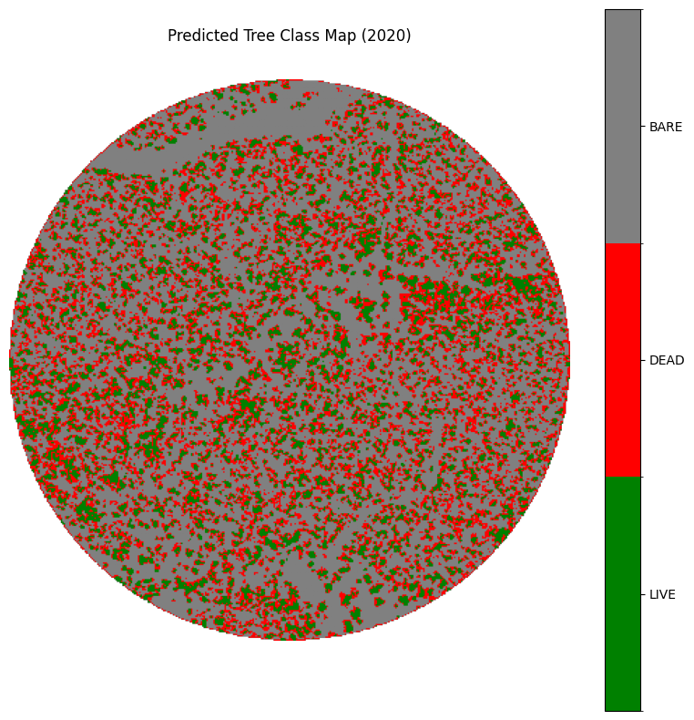
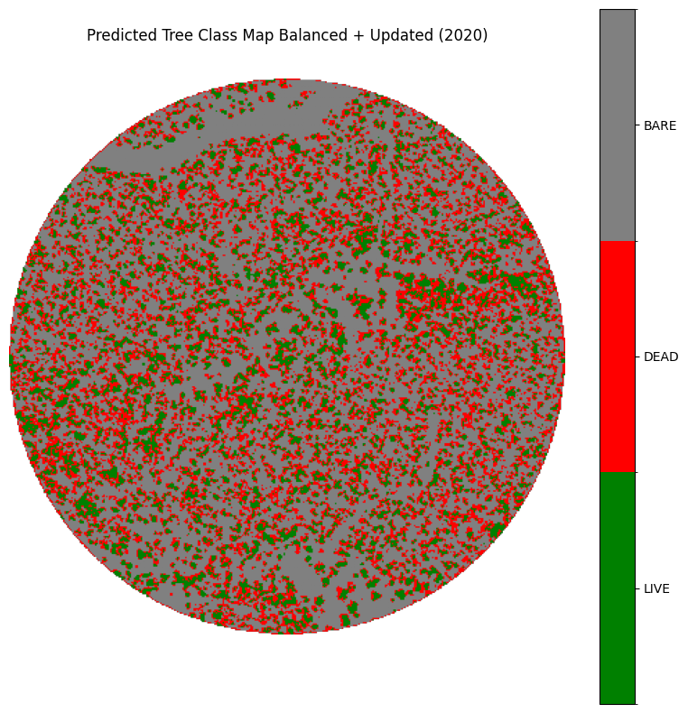
| Class | Pre-Balanced | Post-Balanced | Change (%) |
|---|---|---|---|
| LIVE | 21,628 | 21,241 | -1.8% |
| DEAD | 30,339 | 31,112 | +2.5% |
| BARE | 74,156 | 73,770 | -0.5% |
Observation
Balancing helped reduce DEAD under prediction and slightly corrected LIVE overconfidence.
NDVI Histogram (By Class)
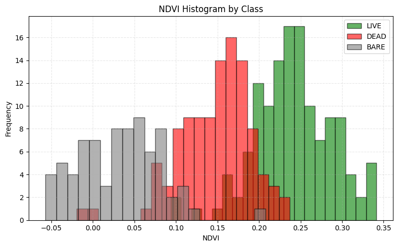
Interpretation
- LIVE pixels form a clear NDVI peak between 0.22–0.30
- DEAD overlaps with both LIVE and BARE, consistent with its ambiguous spectral signature
- BARE clusters near NDVI < 0.1
Predicted Maps Across Time (2014–2022)
The updated model was applied to all years in the dataset.
Notable Observations
- 2014/2016: More DEAD patches, especially in the southern region
- 2018/2020: Recovery in LIVE pixels in central/northern zones
- 2022: Strong LIVE presence with balanced BARE–DEAD structure
Class Distribution Trends (Pixel-Level)
Grouped Bar Chart
Line Chart (Per Class Over Time)
Insights
- BARE remains consistent (~45–47%) — acts as a stable control
- DEAD rises in 2016–2020, then drops in 2022
- LIVE shows a recovery in 2022 after dip in 2016–2018
Statistical Validation: Chi-Square Test
To test whether the distribution of class predictions changed meaningfully across years, I ran a chi-square test on predicted class counts.
Results
Chi2 Statistic: 3688.71
Degrees of Freedom: 8
P-value: < 0.000001
Interpretation
The test confirms that class distributions are not independent across years — vegetation structure has changed significantly over time.
| Year | LIVE (Obs) | LIVE (Exp) | DEAD (Obs) | DEAD (Exp) | BARE (Obs) | BARE (Exp) |
|---|---|---|---|---|---|---|
| 2014 | 14035 | 17810.18 | 41409 | 35921.25 | 70185 | 71897.57 |
| 2016 | 17560 | 17810.18 | 38873 | 35921.25 | 69196 | 71897.57 |
| 2018 | 18983 | 17880.21 | 34204 | 36062.50 | 72936 | 72180.29 |
| 2020 | 21241 | 17880.21 | 31112 | 36062.50 | 73770 | 72180.29 |
| 2022 | 17442 | 17880.21 | 34432 | 36062.50 | 74249 | 72180.29 |
Conclusions
- Class balancing significantly improved DEAD prediction
- The model generalizes well across years, both visually and statistically
- NDVI remains the most valuable signal for distinguishing LIVE and BARE
- Predicted maps reflect meaningful ecological shifts — particularly post-2020 regrowth
Next Steps
- Incorporate 3×3 or 5×5 patch features to provide spatial context
- Analyze temporal transitions such as LIVE → DEAD or DEAD → BARE
- Investigate spatial drift between years by comparing prediction shifts in fixed coordinates
- Validate results with external field survey data or high-res canopy maps
- Expand the labeling dataset to include denser forest sections for generalization